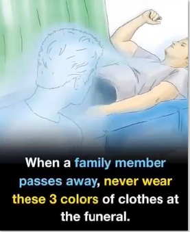
Funerals are moments of deep respect and reflection, and the colors you wear silently communicate your sensitivity to that tone.
While personal style has its place, some colors—though fashionable elsewhere—can unintentionally appear disrespectful in this solemn setting.
Bright red is the most important shade to avoid. Across many cultures, red symbolizes love, joy, or celebration, making it
feel inappropriate during mourning. Unless specifically requested for cultural or religious reasons, red should be left out entirely.
Equally unsuitable are neon or flashy tones like hot pink, lime green, orange, or bright yellow, which are often associated with fun and festivity.
Metallics, sequins, or shiny fabrics in gold or silver can also draw unnecessary attention, clashing with the subdued spirit of the day.
Instead, choose dark, muted colors such as black, navy, charcoal, or deep brown. If you don’t have darker clothing, soft neutrals like beige
or muted gray are acceptable. The key is modesty—simple designs, minimal accessories, and tones that convey empathy and respect.
By avoiding loud colors, you help preserve the focus where it belongs: honoring the departed and comforting those grieving, not standing out in the crowd.